Introduction: Why Does My Design Still Look Amateurish?
“Why does my design look off, even when I copy professional references?”
If you’ve ever felt this way, you’re not alone. The difference between a professional-looking design and a beginner’s attempt often lies in understanding the principles behind the visuals, not just copying fonts or layouts.
Great designers don’t just follow trends. They build strong foundations with layout, typography, and color—the three pillars of timeless design. And the good news? Design is not about innate talent. It’s a skill anyone can learn and improve with the right knowledge and practice.
In this guide, we’ll uncover 7 practical design tips that will help you transform your work from “okay” to “professional.”
1. Master the Power of White Space (Negative Space)
White space isn’t wasted space—it’s a crucial design element. It gives content room to breathe, improves readability, and highlights what truly matters. A cluttered design feels chaotic, while generous white space creates elegance and focus.
2. Build a Visual Hierarchy
Your audience’s eyes should naturally flow from the most important elements to the least. Use size, contrast, color, and positioning to establish priority. Headlines should be bold and large, while supporting text should remain subtle. A clear hierarchy makes designs easy to navigate.
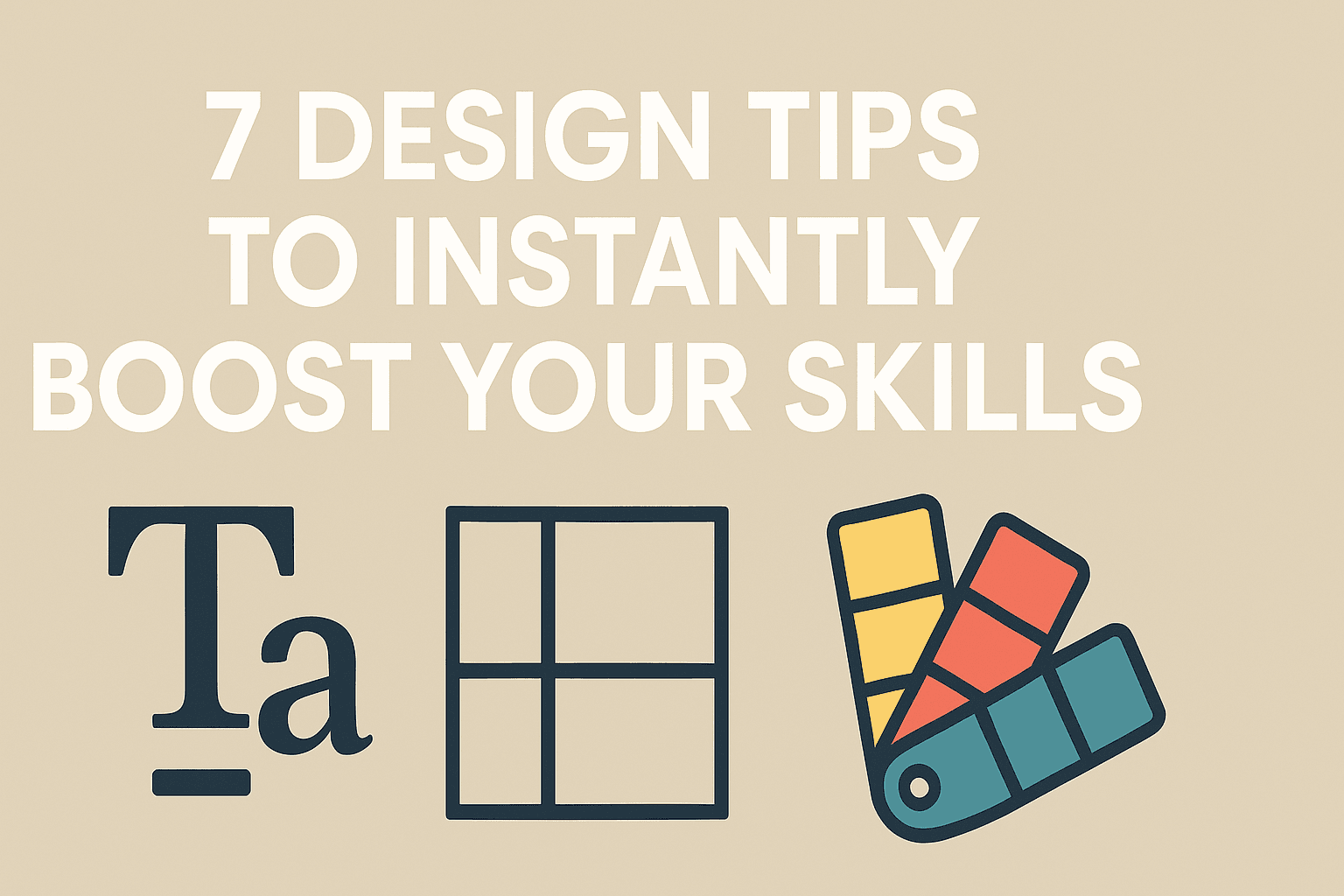
3. Use a Grid System for Consistency
Grids are the invisible backbone of good design. They help you align and structure content with balance and consistency. Whether you’re designing a poster, a website, or an app, grids bring order, stability, and a polished look.
4. Stick to a Maximum of Two Fonts
Too many fonts = instant amateur vibes. Professionals typically use just two complementary fonts—one for headings and another for body text. For example, pair a serif with a sans-serif, or mix different weights of the same family. Less is more.
5. Adjust Letter Spacing and Line Height for Readability
Typography isn’t just about choosing fonts—it’s also about spacing. Proper kerning (letter spacing) and line height make text easier to read. As a rule of thumb, line height should be around 1.5x the font size for body text.
6. Use Font Weights to Create Emphasis
Font weights (Light, Regular, Bold, Black) help you structure text visually. Headlines should be bold and attention-grabbing, while body text stays regular. Using weights smartly adds depth and clarity to your design.
7. Apply the 60-30-10 Color Rule
Color makes the first emotional impact. To avoid messy palettes, use the 60-30-10 rule:
60% main color (background)
30% secondary color (supporting elements)
10% accent color (buttons, highlights)
This formula ensures balance while keeping your design dynamic. Combine it with color psychology (blue = trust, red = energy, green = growth) to align with your brand message.
Conclusion: Practice, Feedback, and Growth
Good design starts with understanding the fundamentals. With layout, typography, and color as your toolkit, you can instantly make your work look more professional.
Don’t just read—apply one tip today. Add more white space, refine your line spacing, or rework your color palette. Small adjustments create big results. And remember: design is a marathon. With practice and feedback, your skills will grow steadily.