Design isn’t just about aesthetics — it’s about communication, structure, and balance.
The best designers aren’t those who know every tool, but those who understand how to guide the viewer’s eye and communicate clearly.
The good news? You don’t need years of experience or formal training.
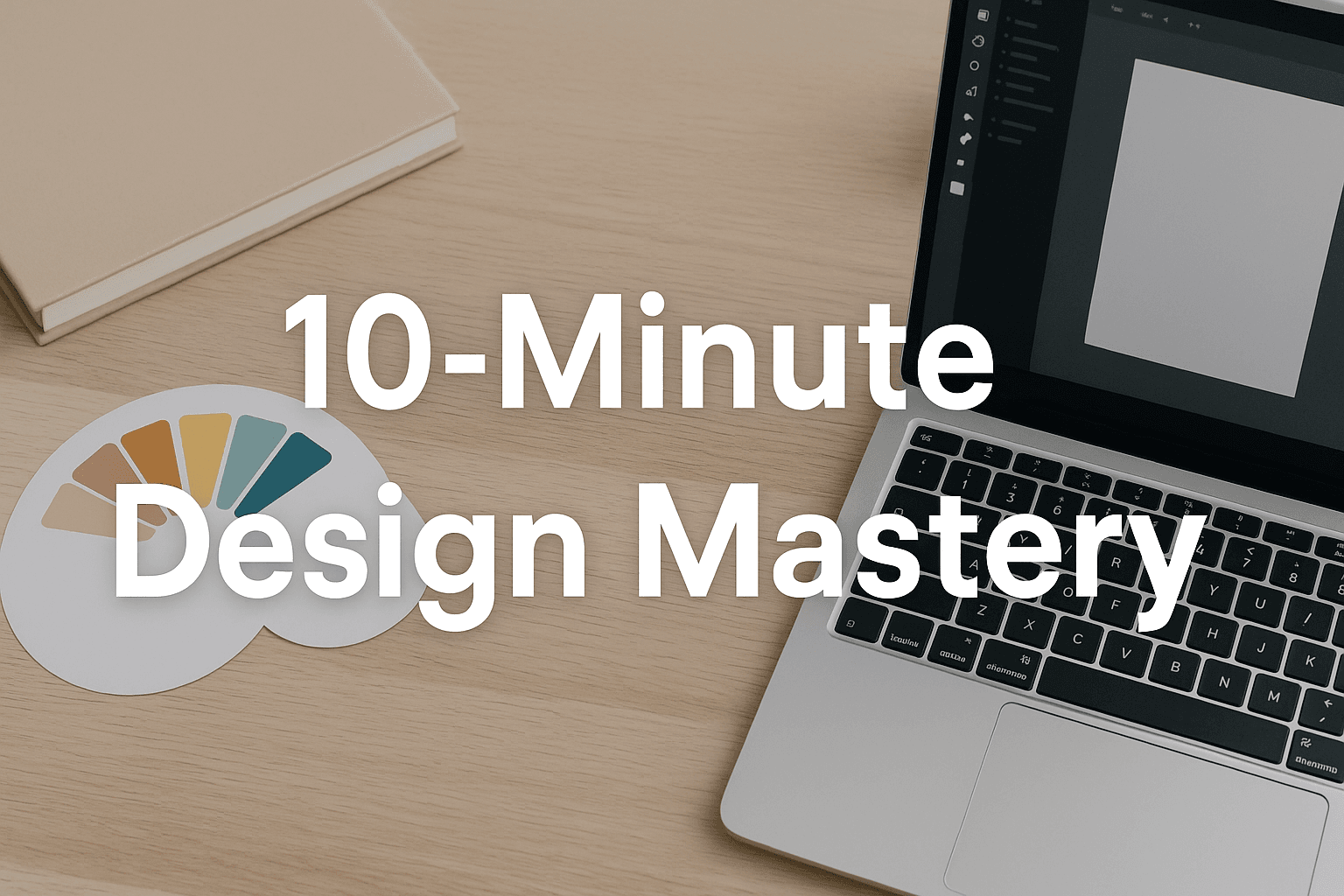
In just 10 minutes, you can apply these 5 core principles that every professional designer uses daily — whether you’re creating social media posts, presentations, or web layouts.
🎨 Step 1: Simplify Your Color Palette
Color is the foundation of good design, but beginners often overdo it — using too many shades, tones, and gradients.
Professional designers, on the other hand, rely on limited color systems to create visual harmony.
✅ What to Do
- Stick to 2 primary colors and 1 accent color.
- Maintain consistent contrast ratios for readability (aim for a 4.5:1 ratio between text and background).
- Use tools like Coolors or Adobe Color to generate accessible palettes.
🎯 Pro Example
A clean web layout might use:
- Primary: Navy blue (#0B3C5D)
- Secondary: Light gray (#F5F5F5)
- Accent: Coral (#FF6F61)
⚡ Pro Tip
Avoid pure black (#000000).
Use dark gray (#2C2C2C) instead — it creates a softer, more natural look on modern screens.
📏 Step 2: Master Alignment and Spacing
Alignment is the unsung hero of design.
Even if your colors and fonts are perfect, misaligned elements instantly make your design feel messy or amateurish.
✅ What to Do
- Use grids and rulers in tools like Figma or Canva.
- Align all text and visuals to a consistent baseline.
- Maintain even margins (at least 16px between text blocks).
- Keep equal spacing between similar elements for visual rhythm.
⚡ Pro Tip
Most professional designers follow the 8-point grid system — spacing in multiples of 8px (8, 16, 24, 32, etc.).
It makes alignment predictable and aesthetically balanced.
🔤 Step 3: Typography — The Voice of Your Design
Typography defines tone and emotion.
A playful sans-serif font communicates differently from a classic serif typeface.
✅ What to Do
- Use two fonts maximum: one for headings and one for body text.
- Set clear hierarchy using font weight and size, not color alone.
- Maintain line spacing (1.4–1.6x font size) for readability.
- Avoid script or novelty fonts for paragraphs — they reduce clarity.
🎯 Recommended Font Pairings
| Heading Font | Body Font | Feel |
|---|---|---|
| Montserrat | Open Sans | Modern, clean |
| Playfair Display | Lato | Elegant, minimal |
| Poppins | Roboto | Friendly, tech-style |
| Libre Baskerville | Source Sans Pro | Editorial, classic |
⚡ Pro Tip
Use free font resources from Google Fonts for reliable cross-platform rendering.
🧩 Step 4: Embrace Whitespace and Balance
Whitespace — or “negative space” — is what separates amateur clutter from professional clarity.
It gives your design room to breathe and directs attention to what truly matters.
✅ What to Do
- Add padding around text and images (20–40px is ideal).
- Leave space between sections — don’t fear “empty” areas.
- Use visual balance: heavy elements (like photos) on one side can be balanced with light areas (like text) on the other.
⚡ Pro Tip
Professional designers often follow the Rule of Thirds — divide your canvas into three equal parts (horizontally and vertically) and place key elements along those lines for natural composition.
🔁 Step 5: Consistency Is King
Consistency builds trust.
When fonts, colors, and layouts remain predictable, your design feels polished — like it came from the same brand family.
✅ What to Do
- Define a mini style guide before you start:
- Heading sizes (H1–H3)
- Button colors
- Image filters
- Border radius
- Reuse components — don’t redesign buttons or icons each time.
- Maintain consistent margins and typography scale.
⚡ Pro Tip
In Figma, you can create a “Component Library.”
It lets you reuse design elements (like buttons or cards) across multiple pages — just like pros do.
🌟 Bonus: Free Tools Every Beginner Should Know
| Tool | Use Case | Link |
|---|---|---|
| Canva | Quick visual content, templates | https://www.canva.com |
| Figma | Web & app UI design | https://www.figma.com |
| Unsplash | Free high-quality stock images | https://unsplash.com |
| Coolors | Generate and test color palettes | https://coolors.co |
| Google Fonts | Free web fonts library | https://fonts.google.com |
| Remove.bg | Quick background removal | https://www.remove.bg |
🧠 Final Thoughts
Great design isn’t about knowing Photoshop inside out — it’s about understanding visual logic.
When you use alignment, spacing, typography, and color consistently, even simple designs feel professional.
You don’t need years of study — you just need structure and intention.
Start small, design daily, and refine as you go.
“Design is intelligence made visible.” — Alina Wheeler
💬 Ready to Level Up Your Design Skills?
Start now with these beginner-friendly tools — and see your design confidence grow within minutes.
👉 Explore design tools and courses for beginners